June snow
June 13, 2008
It has snowed two or three days in a row. I didn’t have long, but wanted to see how the Trail was doing.
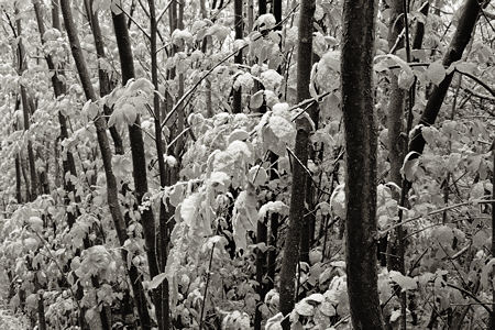
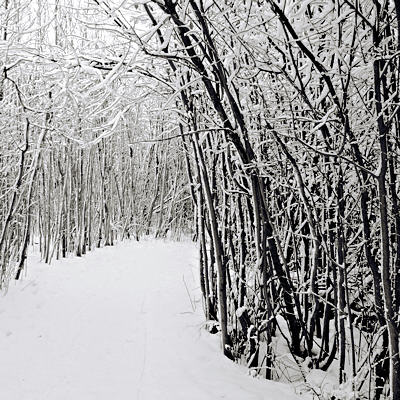
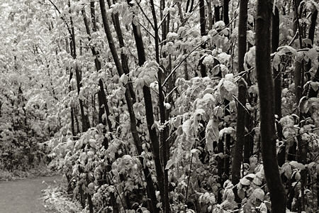
The spot shown above, like those in the Revisiting post, is in a previously photographed stretch (see winter image below). I didn’t want to do the same view, partly because it tended toward cliché to begin with, and partly because a large expanse of plain gray path seemed unattractive.
Should aesthetics govern in such a thing? Well, if not, I wouldn’t be photographing at all. It’s almost painful to make a photograph I don’t care about in that way. Some aesthetic consideration, however idiosyncratic, seems a necessary gesture of respect to both place and myself. But perhaps a little path would be permissible…
This short section (five yards? ten?) reminds me of bamboo groves in Japan. It’s a similarity that at the same time reinforces the differences: of leaf, of bark, of girth, of straightness, of darkness of trunk. By knowing another place, I know this place better. Contrast is fundamental.
Filed in: Musings.

I rather like the image with the great swathe of path, because of the relative darkness/lightness of the three sections. To me, it doesn’t read as “cliche path in the winter woods” so much as “lightest dynamic third.” I find the relative uniformity of the third image less engaging. It’s hard to know what I’m looking at (the forest for the trees) — it seems to fall too squarely between abstraction and figuration — and I’m distracted by that.
Edward Weston took some photographs in an attic with steep gables that have a similar compositional effect. There’s on in the Legacy book, and another here:
http://images.google.com/imgres?imgurl=http://www.artnet.com/Images/magazine/news/artmarketwatch/artmarketwatch4-6-07-12.jpg&imgrefurl=http://www.artnet.com/magazineus/news/artmarketwatch/artmarketwatch4-6-07_detail.asp%3Fpicnum%3D12&h=480&w=368&sz=69&hl=en&start=199&um=1&tbnid=RqJts7hFoxUxQM:&tbnh=129&tbnw=99&prev=/images%3Fq%3Dedward%2Bweston%26start%3D180%26ndsp%3D20%26um%3D1%26hl%3Den%26rlz%3D1T4SUNA_en___US209%26sa%3DN
Melanie,
I also like the path in winter, but somehow as mid-gray mud at the moment, I find it less attractive. This points up a weakness in my tone management and/or tone appreciation. One of my goals for this project is to improve on that, so I will take the path as a challenge, and probably the subject of an experiment in the near future: to make an effective image with a dominating mid-gray. I’ll look forward to your discerning comments then.
I agree the last image is weakest, though it might work better in a largish print, where even the smaller proportion of area given to the path is enough to merit attention, and the differentiation across the image by degree of sharpness is easier to appreciate. I actually made it first, then went on to make the photograph shown at the beginning of the post.
Oh, and thanks for breaking the formatting with your long URL! I’m in the process of re-designing the blog theme, and that’s one thing I should be able to fix.
Holding up two of the envelopes from the heap waiting to be filed, and cropping in from the sides, I find I like third image better if it’s almost square, with the tiniest bit taken out the left and most of the cropping taken from the right. It’s more Japanese, somehow, and puts a gentle focus on that cascade of leaves in the mid-right area.
I want to make a textile piece for a fundraiser — May I use the third image in “Layers of Meaning” as the starting point?
(I envy your solstice snow. It’s been in the high 90s here and the heat makes me fretful and stupid.)
Melanie,
If you crop out the thickest trunk on the right, you’re left with a more delicate image, something I tend to associate with a Japanese aesthetic. I’ve been thinking about that recently, as you’ll see in a post or two. In general, I’m a strong believer in cropping, as composition matters greatly to me. However, I’ve been limiting it so far, intending to come back to some important images in later posts as I develop a clearer understanding of what I want from them.
Some photographers seem to dislike suggestions on such aspects of processing, but I always enjoy hearing someone else’s ideas. So thanks for sharing yours, especially with the thinking behind it.
As for the Layers image, please feel free to use it as you like. Let me know if it would help to have a larger version.
The presumption of good will is such an important component of feedback — and that’s one of the things I treasure about A&P.
Thanks for the go-ahead with using the photo. I think I’ll be all right just by printing it from the site. The pieces for the fundraiser need to finish at 12-inch square — it’s the fashionable size now, I don’t know why, but I find it congenial. I think I can make a drawing that will be fine for the purpose, but if I run into trouble, I may ask. I should warn you that I’m thinking of rendering this in the yellow-orange, blue-green, red-violet triad…
Either something has gone screwy with my monitor or you’ve been playing around with these — yes?
I don’t know what the technical language would be, but the third image seems darker overall, the second seems to have increased contrast (also there seems to be more foreground/curve of the path than previously), and the first is slightly greenish (although my monitor may have lost it’s mind on that one). And they all seem a little scruffy.
I fear for your monitor, Melanie, since nothing’s been altered here. The middle image (winter) has always been a touch colder (bluer) than the others, which have a hint of warm toning. Most (especially cheaper) flat screen monitors (liquid crystal) exhibit strong variations with viewing angle, which is why I do all my processing on a CRT monitor.
oh, of course. I had mostly been studying these at work, not at home on my good-enough-for-text system. Also, there’s the fever.