Focus on the message
May 21, 2008
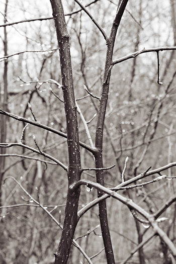
The image above is my favorite from a series taken from the same position, but with depth of field varied using apertures from f/5.6 to f/16. Below is most of the set, with f/8 left out to enable easier comparison of f/11 with either extreme).


The f/11 version seems to me to have the right balance (or tension) between the two saplings as principal subject and the similar shapes in the background. The latter draw the eye much more than with f/5.6, but still leave the central pair dominant. I find f/5.6 over-emphasizes the isolation of the pair from the surroundings, while f/16 gives too little separation, making the image feel too complex and confusing. In general, I like complexity, but complexity with structure.
Be that as it may, I think the main point here is that changing depth of field changes the message. As I commented in discussion on Art and Perception
What I “want to say” is not so clear yet, which is why I chose this image to illustrate the issue. Or rather, I want to say both that here’s an interesting pair of saplings entangling and they’re here entangled in an interesting patch of woods.
At the time I made the photograph, I was thinking of the saplings as purely visual elements, whose relationship I adjusted by the camera position. It wasn’t until processing at the computer that the allusion to human figures embracing occurred to me. This fits right in with recent musings at A&P on the subliminal significance of the figure.
Filed in: Experiments,Lessons.

Re: “One might posit that maximum sharpness throughout makes for the most “accurate” image, but it’s clear that it gives rise to an inevitable emotional response that may not at all represent what a person (in particular, the photographer) experiences in the actual setting.”
Regardless of subject, framing, and focal length &c., can these images be “accurate” in the sense of “objective” without color? (I hold that black, white, and gray are colors, but I seem to be in the minority.) I wonder if the limited palette, by removing a layer of overt information and knee-jerk prettiness, encourages a deeper engagement — that is, since leaves are not usually gray, the viewer must look more carefully for other overt clues of leafness in order to understand the sign “leaf” — and whether this initial demand to figure it out leads inevitably to the imposition of a kind of story and/or an emotional overlay?
Have you seen the Scientific American Reports issue on perception? The tag line on the cover is “105 Mind-Bending Illusions: What They Reveal About Your Brain.” The articles inside explore some fascinating anomalies about how we don’t really see what’s in front of us, instead the brain takes input and “makes sense of it” — sometimes by distorting the input rather severely.
The main discussion sparked by Melanie’s great comment took place where she co-posted it on Art and Perception. Here I just want to pick up on two thoughts that are really notes to be expanded on later, or rather themes that will recur throughout this project.
The notion of “accuracy” (the quote is in the following post) seems very problematic to me once one wishes the photograph to represent something about the photographer as well as the photographed. Since that is my wish here, there is a balancing act in which, for example, greater conventional fidelity in rendering the subject may result in less fidelity to the photographer’s thoughts and impressions.
Related to the above is my usual preference for black and white over color photographs. That’s not universal, but it definitely applies here. Monochrome, for me, is a step away from conventional, objective reality and toward a certain strangeness and mystery that I find attractive. More to the point, that mystery and strangeness reflect the way I view this world. Choosing black and white is one aspect of the balancing act.